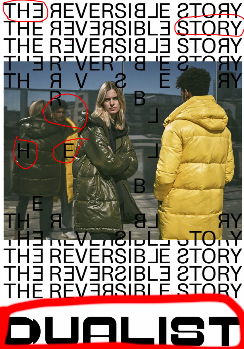
Intro to Dualist
Dualist is a French design house that has just popped up in the last year or so. They want winter clothing to look couture without the ultra expensive price tag. They are located in Paris, France. I would love to visit they’re boutique at some point in my life. I think this add for them tells us loads about them and what they are hopping to do.
The Dualistic Contrast

I love how this add shows us what we are supposed to look at. I took an art class last semester and my teacher taught us that we need to make the eye of the reader move around the page. That is exactly what they are doing with the black type and the white back ground. The yellow and green jackets are also in stark contrast with the white background that the type is set on. This tells me that I need to look at the cloths as well as the type face itself.
Dualists Color
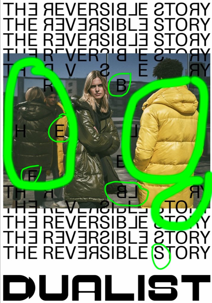
Speaking of those colorful jacket, I like the muted colors on this add. The colors are all muted or tone down slightly. Almost as if they aren’t sharp images which isn’t true when you look at the add. I like again the jackets and how you almost have to make out the letters between the jackets midway up the add. The capital E especially shows me that the creator of this add book was typing to make sure the reader would look around the page. Yet still they didn’t go overboard with there letters in places they shouldn’t be.
Proximity of the E
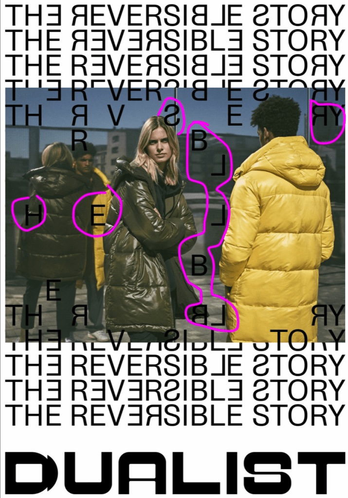
Proximity the E is interesting to me in the center of the add is so interesting to me because its not close to any of letters that are in the add. But yet we know where it belongs and where its going. I love that it looks disorganized and organized at the same time. In our book it says that items that are close together become a “unit”. To me these letters falling are falling randomly but as a unit. I also like the type and how close together the letters are and how some of the letters are reversed.
Repetition, Repetition, Repetition
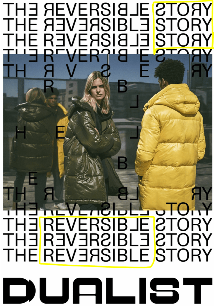
If you notice, they never repeat the same letter combination in the add. For example at the top right hand corner they have the word story, but it isn’t ever the same on the page. either they turn the capital R around or the S. At the bottom of the add they also do the same thing some letters aren’t facing the same way. I like it repeats itself but in a none binary way if that makes sense.
How Dualist Aligns

I kind of had a hard time with this one. Its why I left it for last. But I did notice that the modals on the page were looking into the middle of the page. I don’t know if that was intentional or not but its a cool effect. I like how all the type is aligned and the picture of overplayed onto it.
