My Patterning
I made men’s 70s swim trunks based on a McCall’s Pattern from the 1970s. I had learned so much while doing this project with trimming seams, learning how to take in patterns and how to use good finishings on the product. In this blog post, I will show you how I made these shorts and what I learned. Make sure to click on each image to enlarge it and take a closer look.
McCalls Patterns
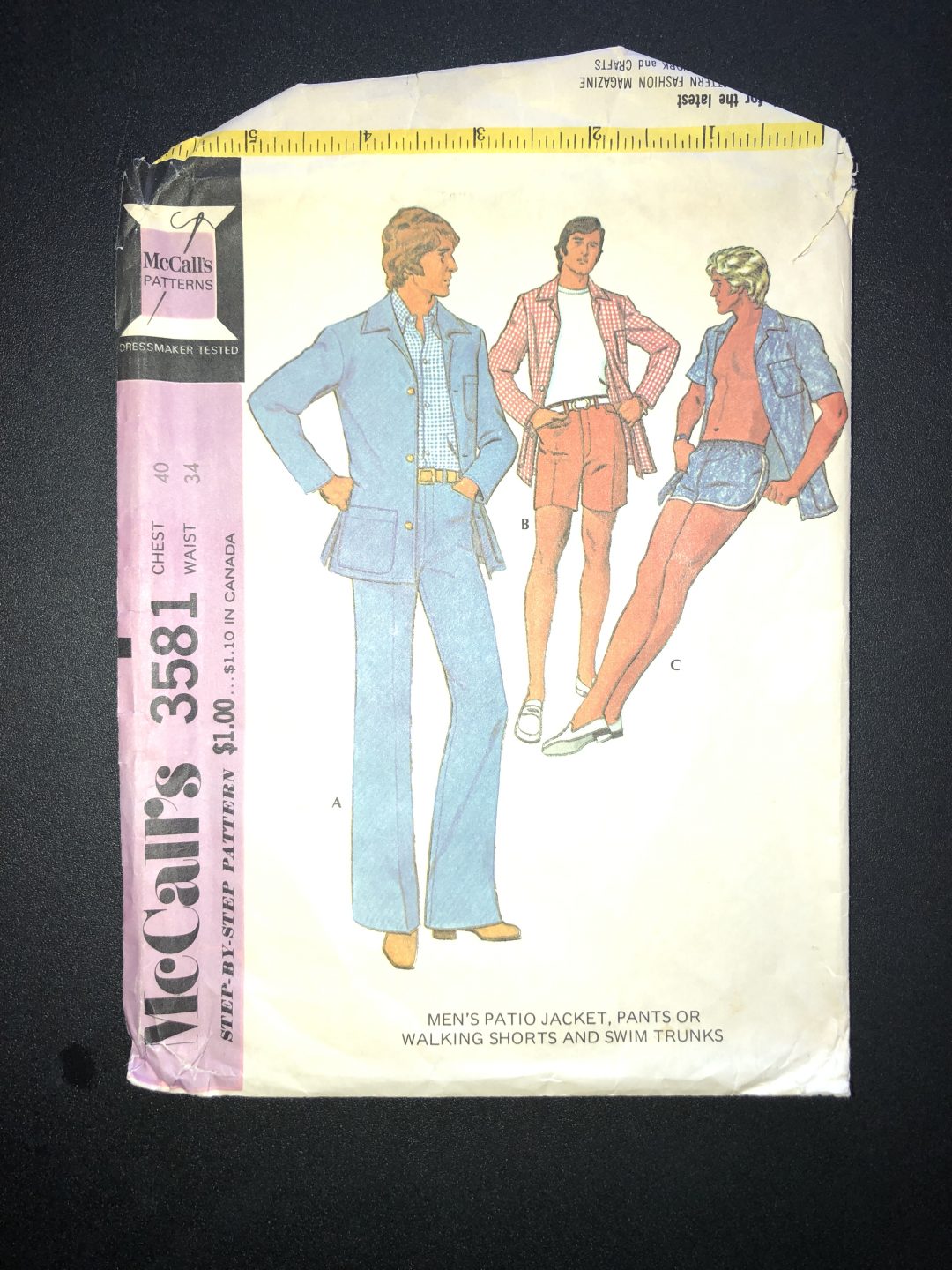
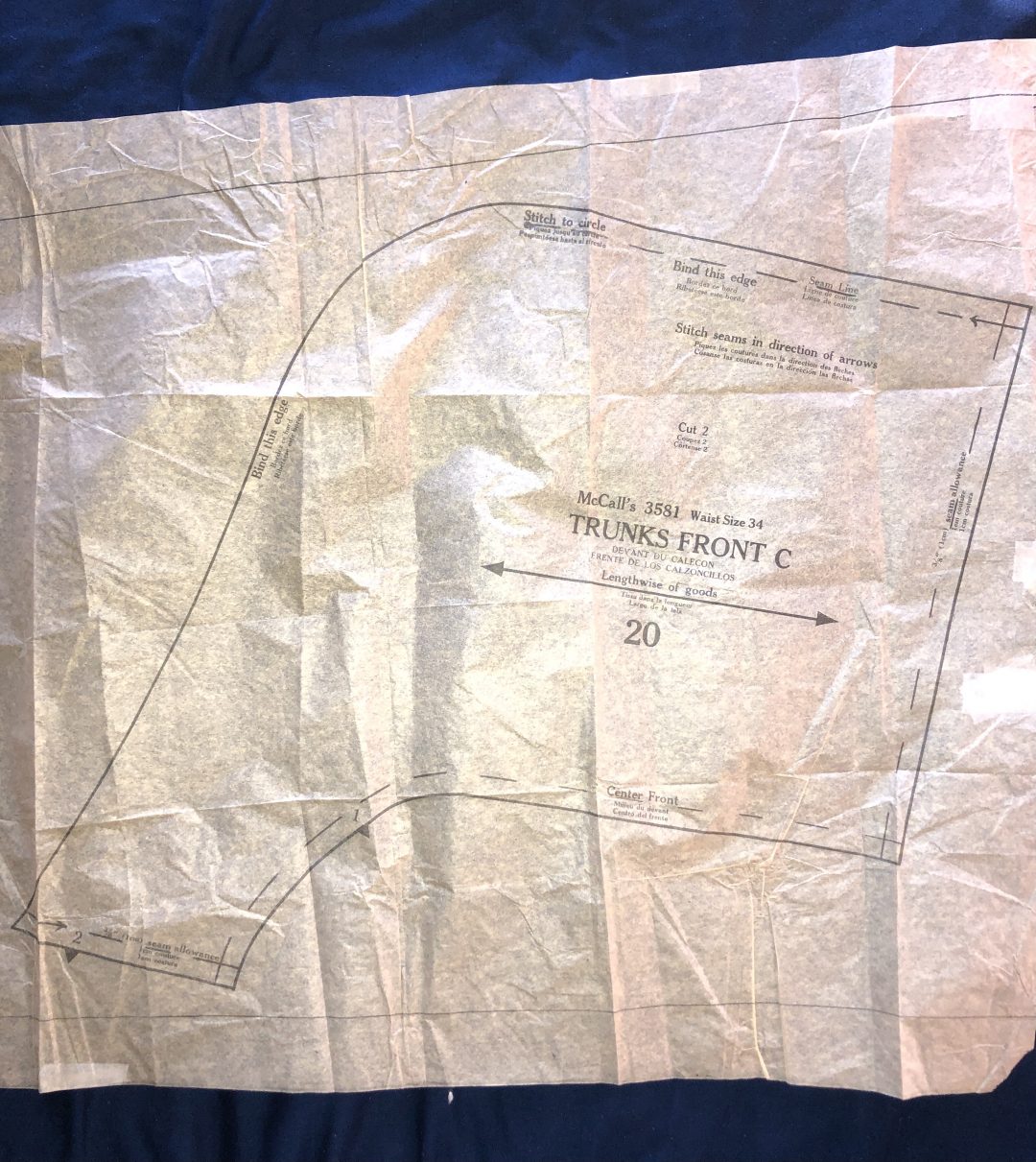
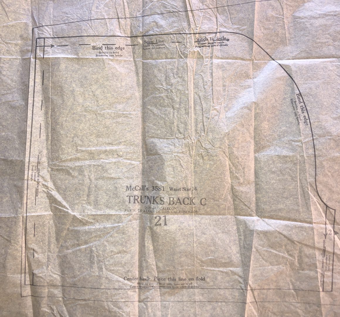
I used a 1972 McCall’s Pattern as my base for this project. I use the word base losly because this pattern was about 4 sizes to large for me, so I had to stink the pattern, which I have never done before. I wanted to add a few things as well, put in side seam pockets as well as lining the shorts. Below you will see the original McCalls Pattern that i bought on Etsy for 7.92.
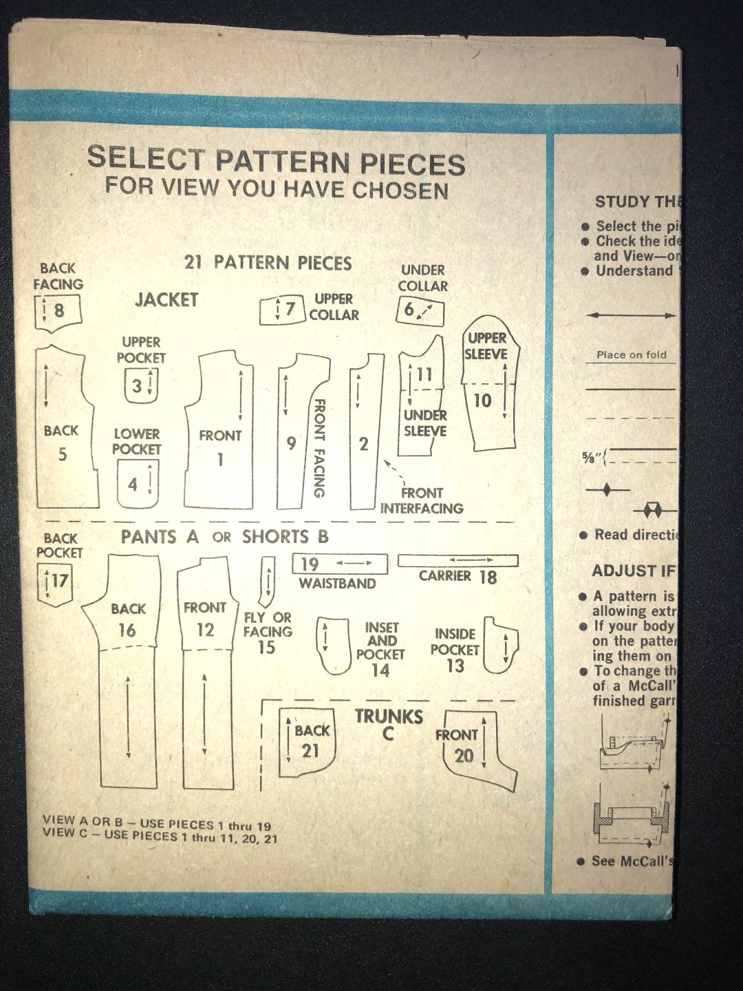
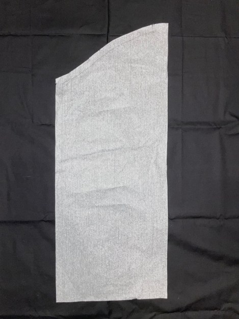
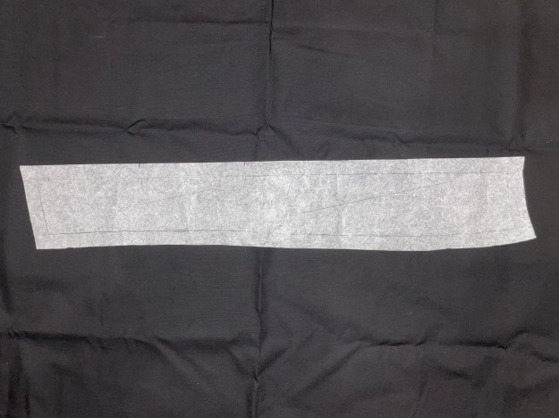
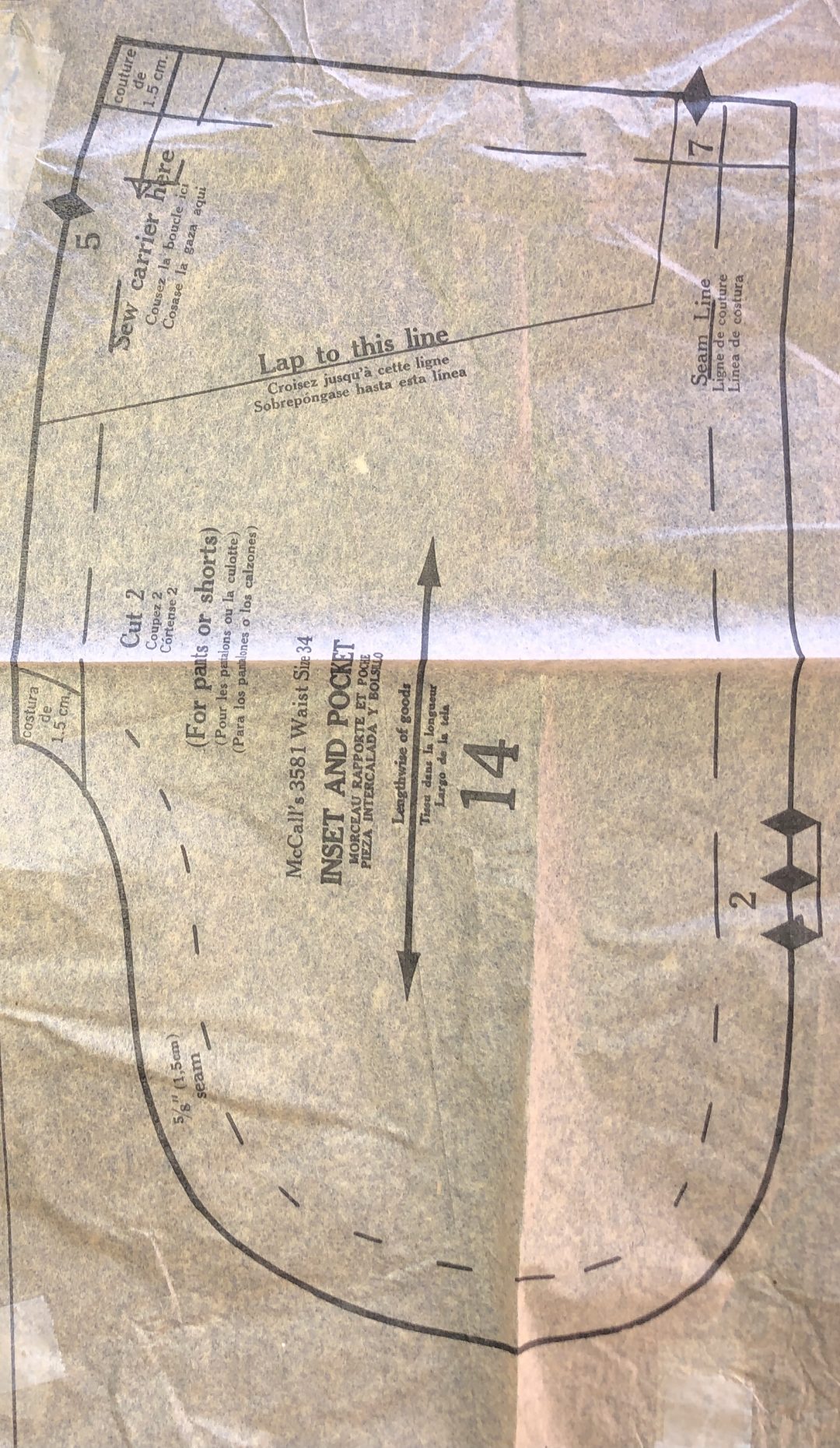
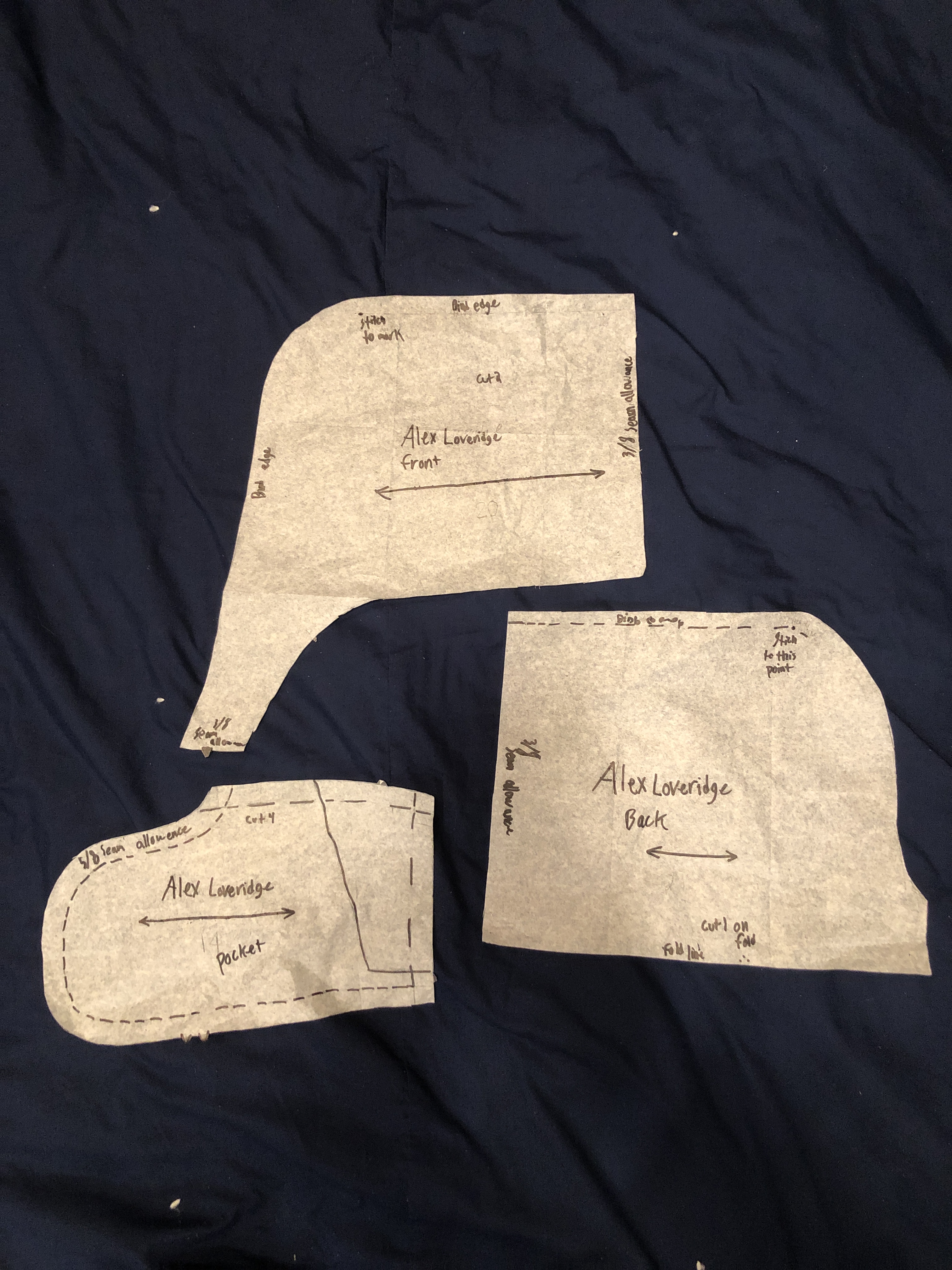
For this project, I used the Inset and Pocket number 14 for my pocket base. I also used Numbers 20 and 21 for the front and back of the trunks themselves.
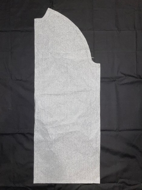
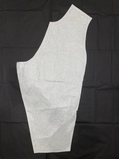
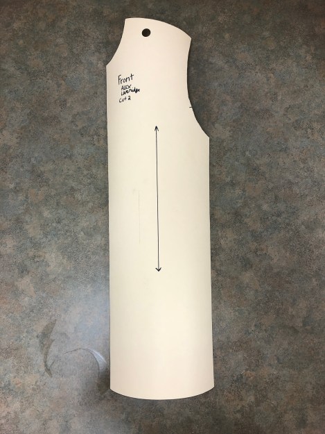
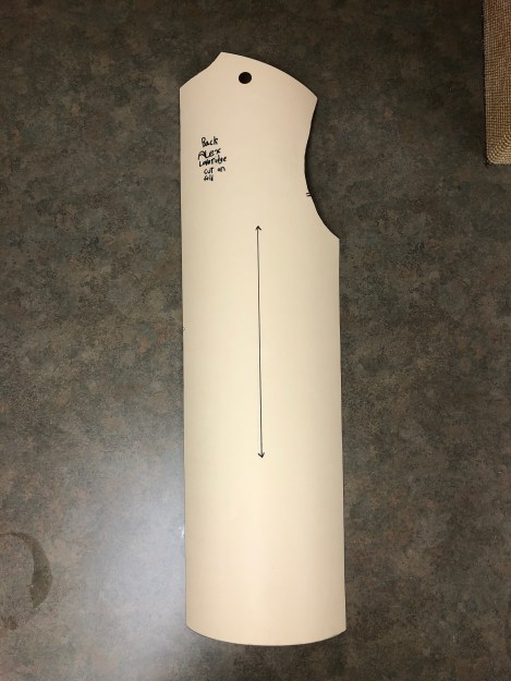
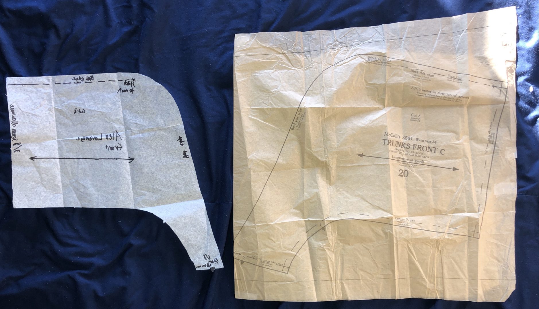
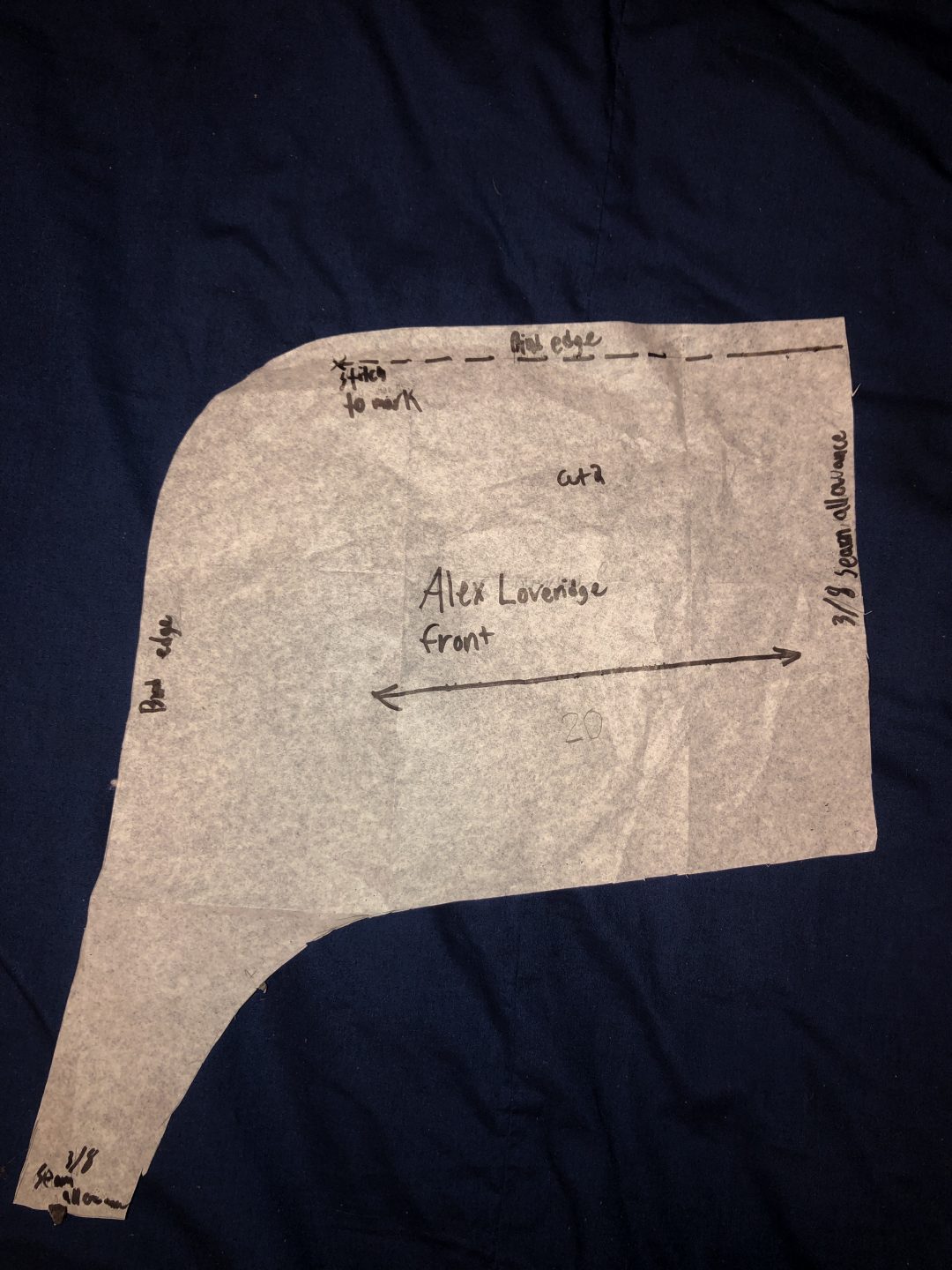
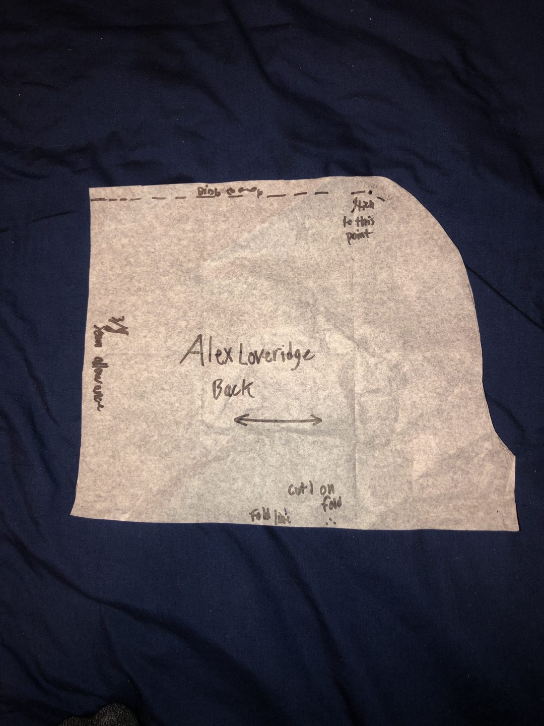
My Patterning
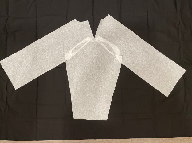
Notice the difference in sizing between the McCall’s Pattern and the one I shrank to better fit my body. I ended up taking in my pattern pieces an inch on all sides. This worked for this project but I can see how I should have only taken half of that on the crotch area.
Front
Back

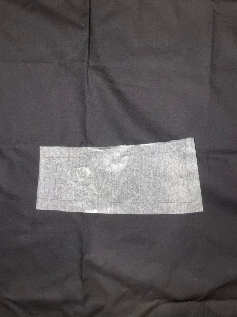
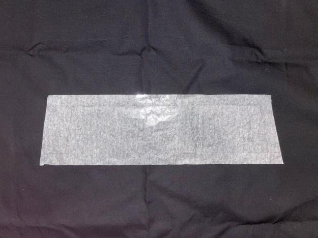
All three of my patterns
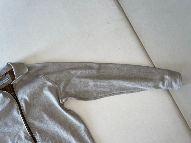
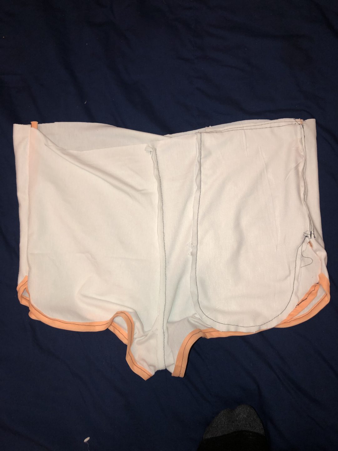
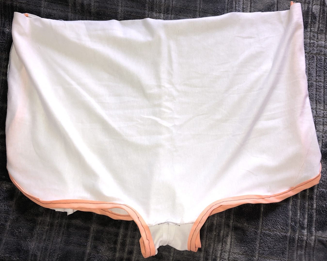
Mock Up
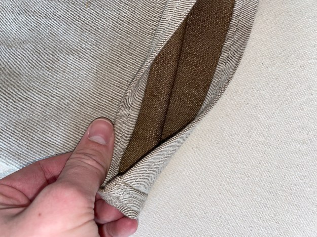
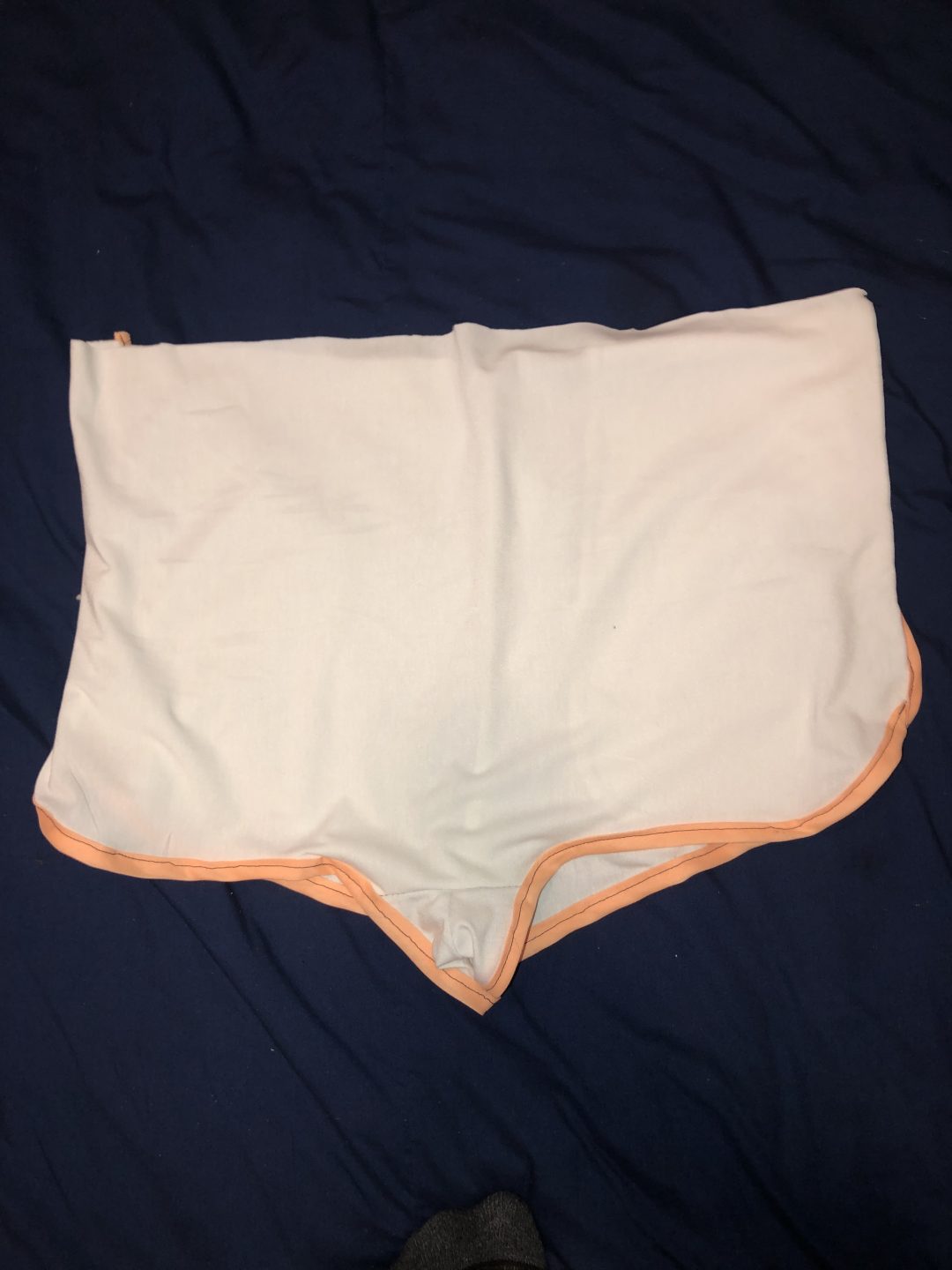
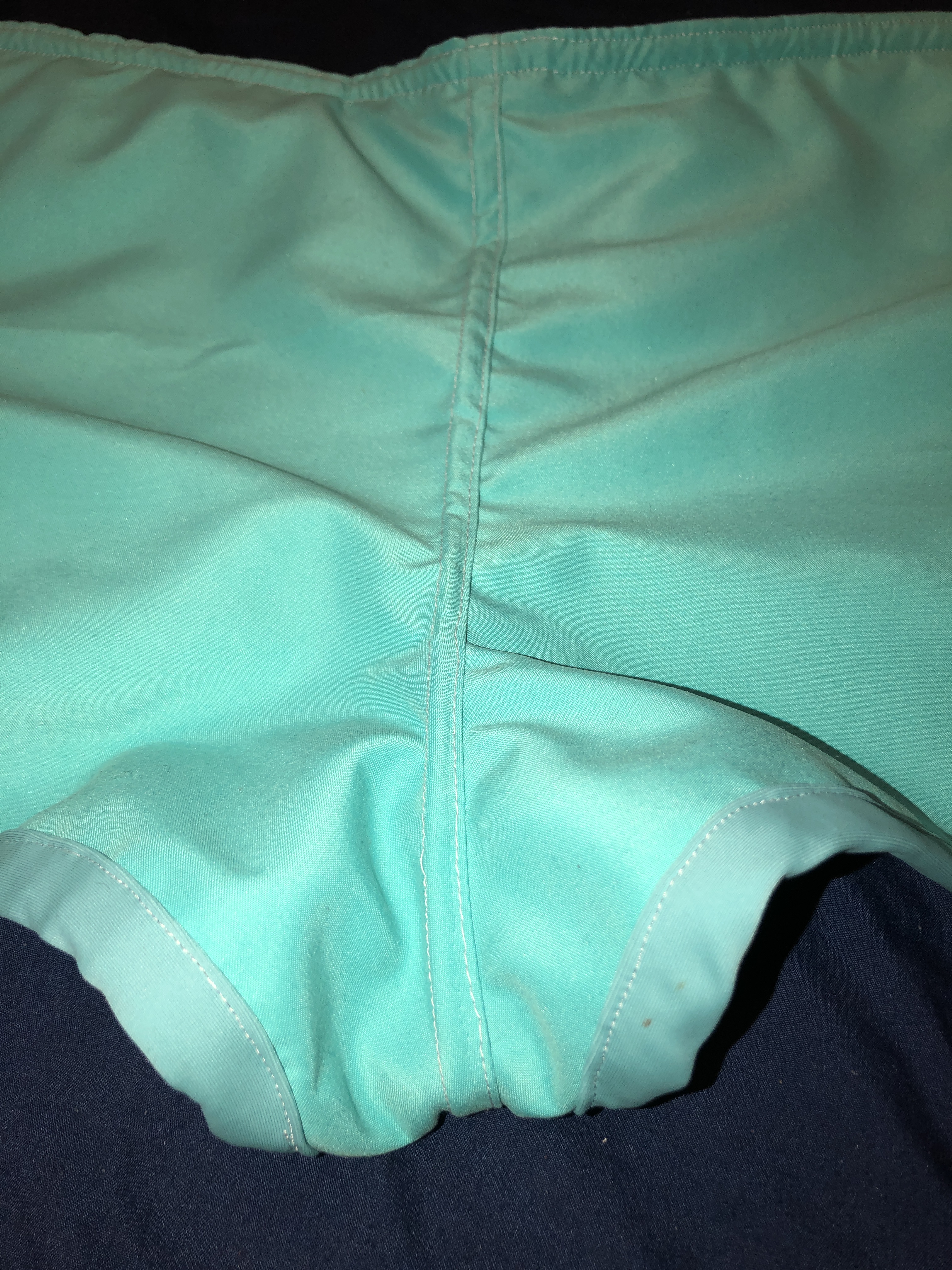
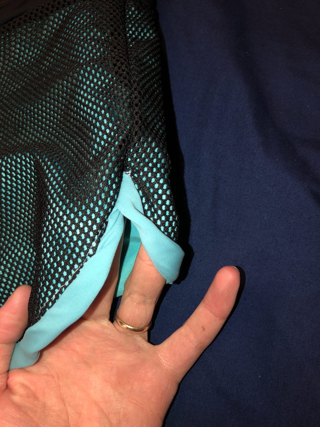
While making this mock up, I discovered how large this pattern really was. I too it in an inch on all sides, this enabled me to make the smaller changes to fit it better to my body. Notice below that I put the bias tape on to test the best way to put it on. By the end of this project, I feel that I am a master at bias tape and how it should look. I also put in 1 of the side seam pockets on the right hand side. I didn’t see a point in putting in both pockets, that just seemed redundant and time wasting . I also tested the steps needed to complete this project. I tested when and how to put on the bias tape, how to put in the pocket, and went to connect all of these pieces together.

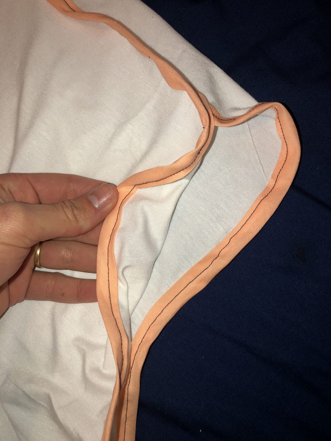
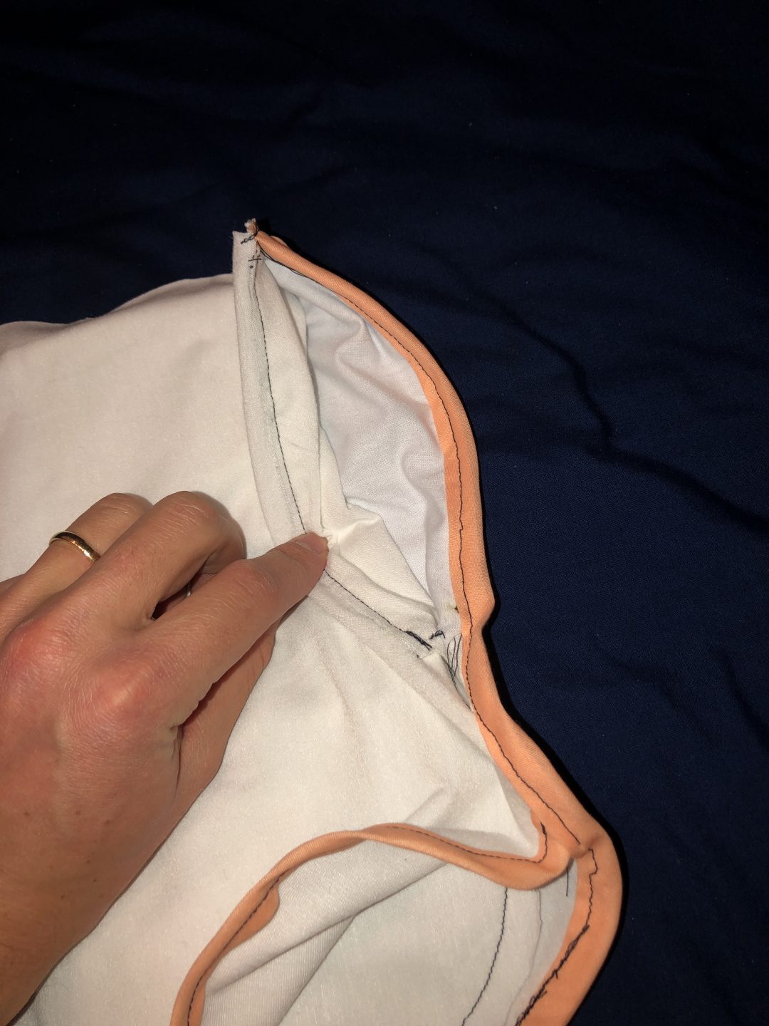
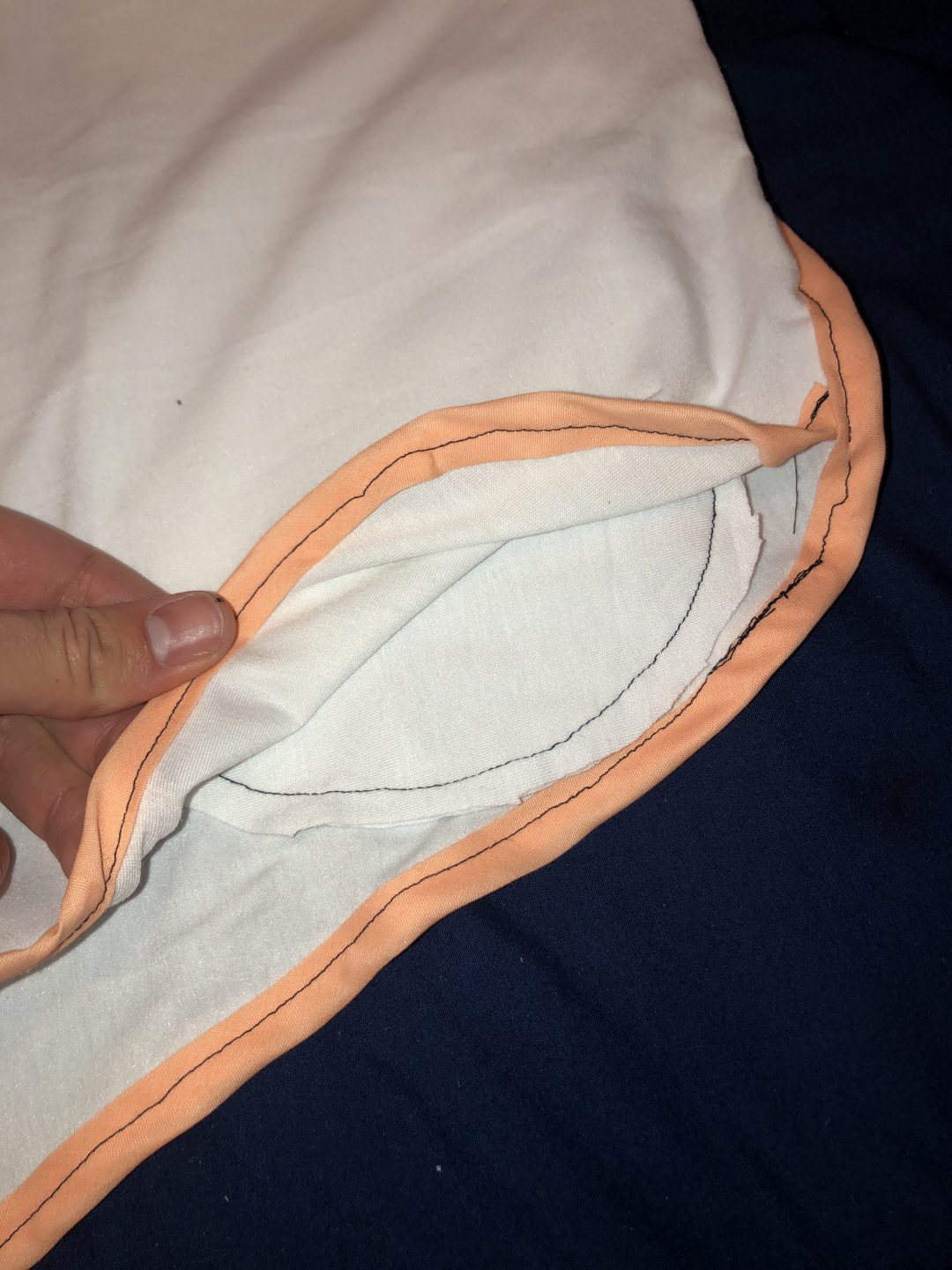
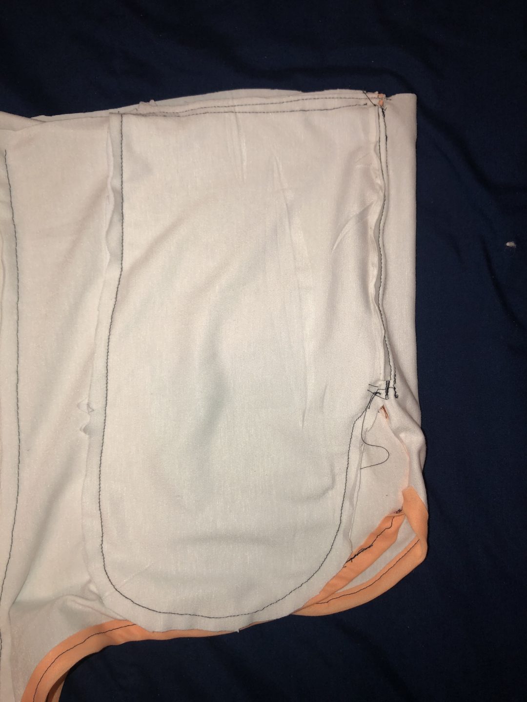
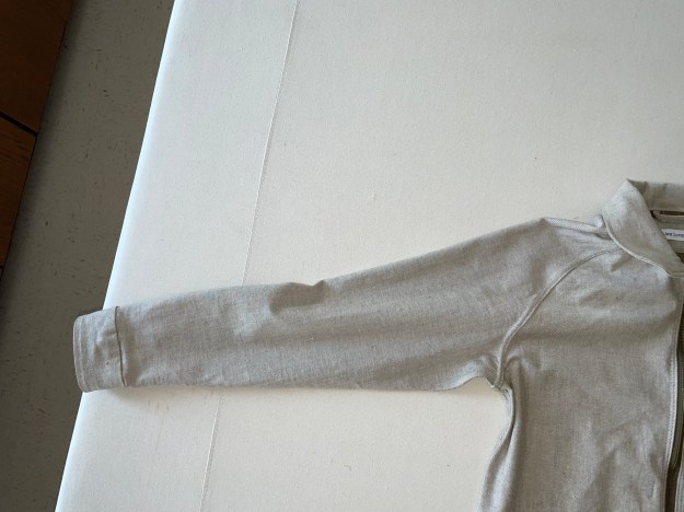
Inside Mock up
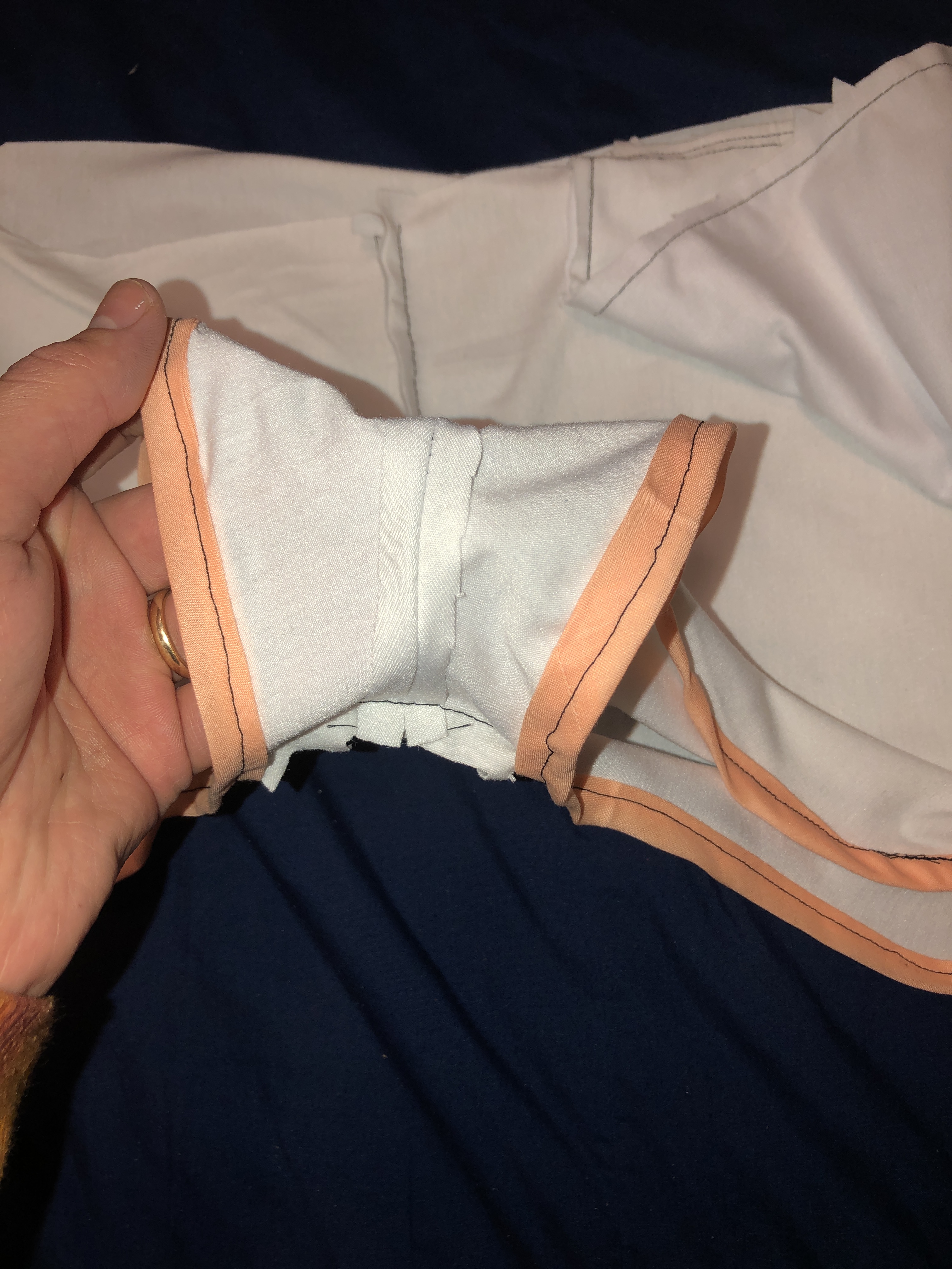
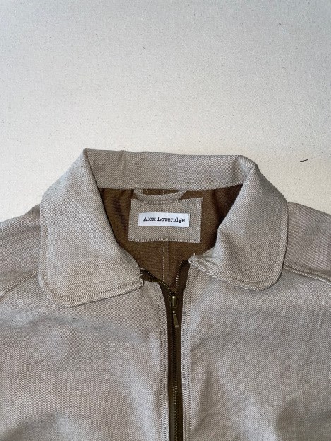
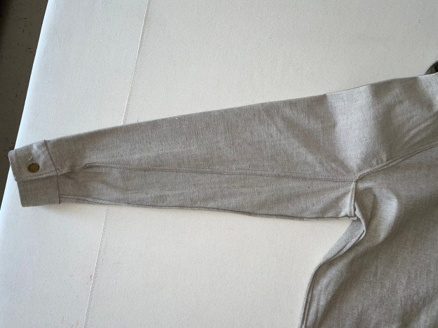
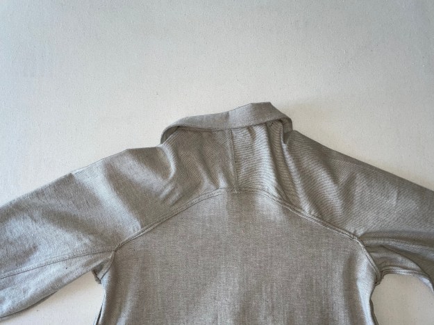
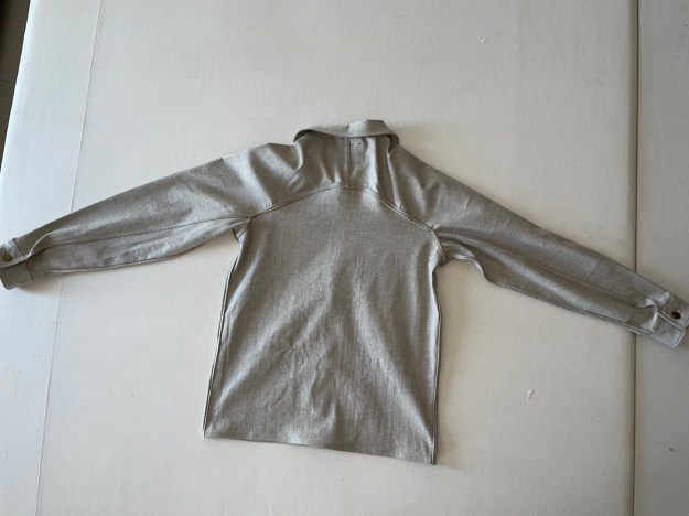
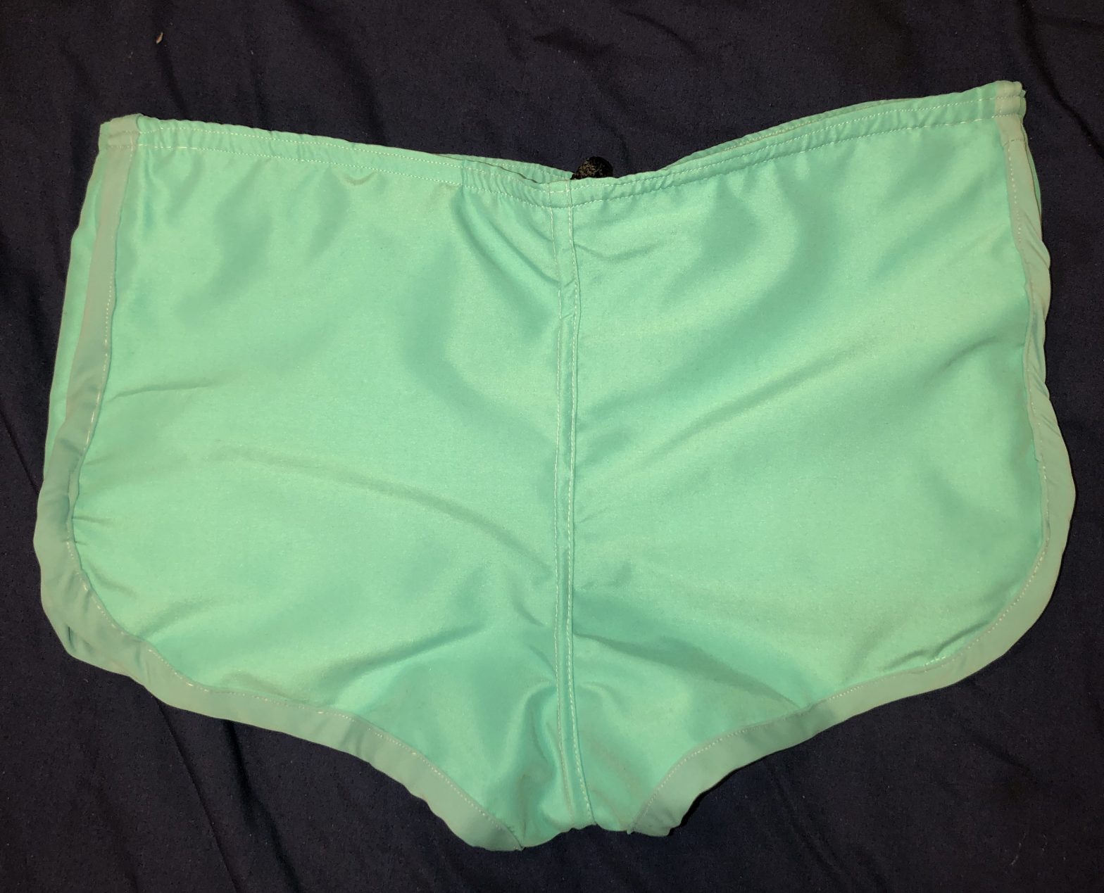
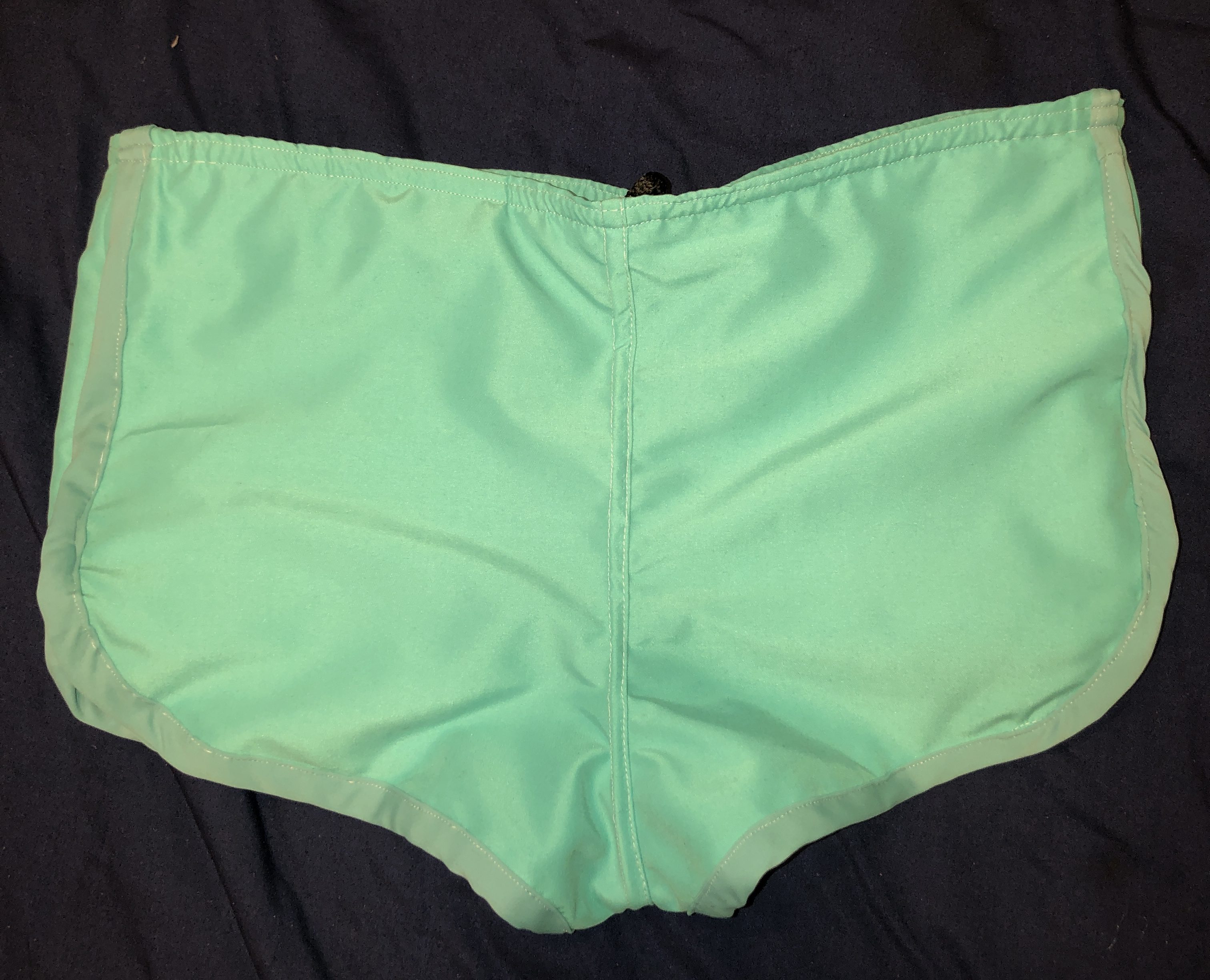
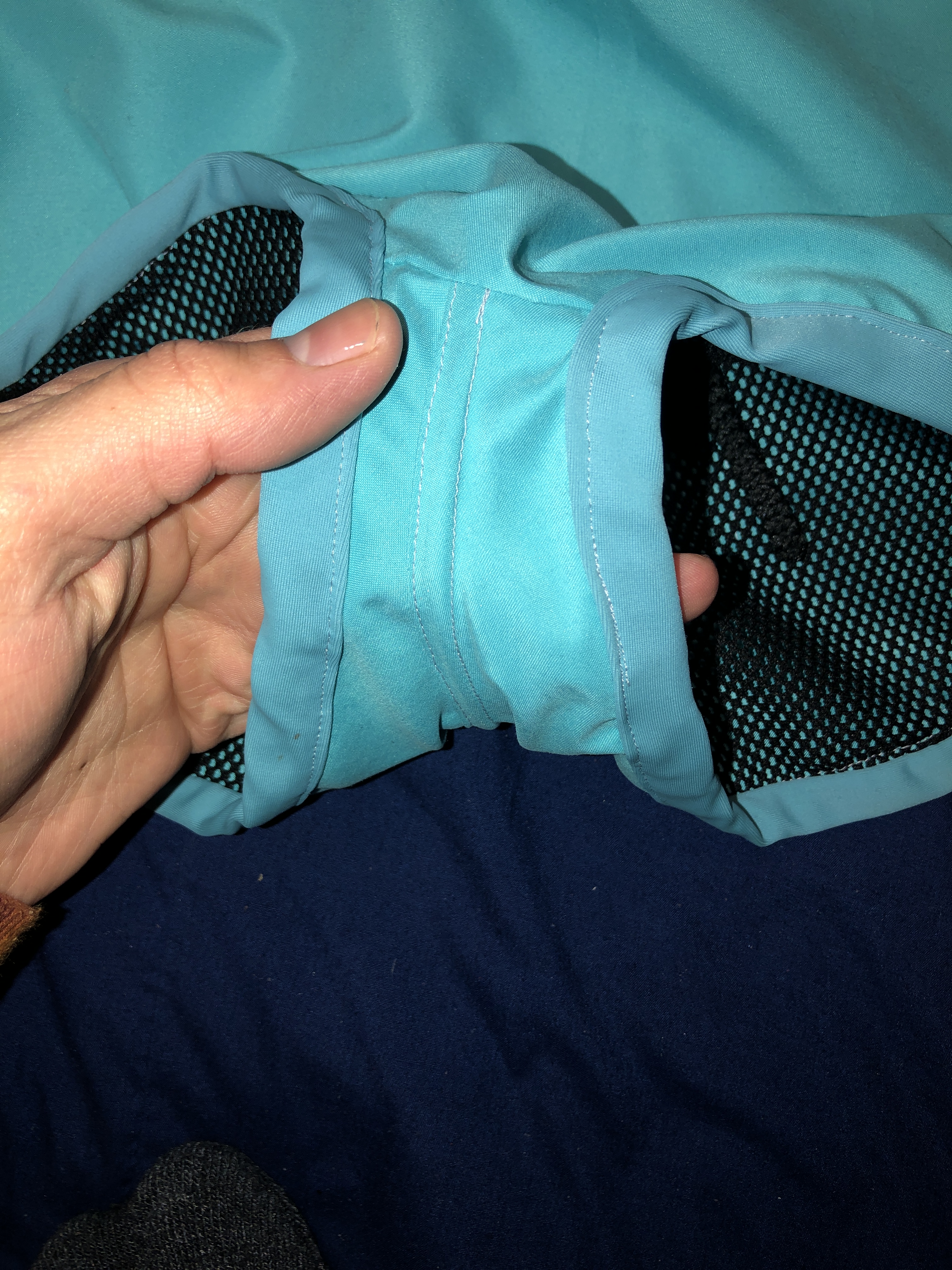
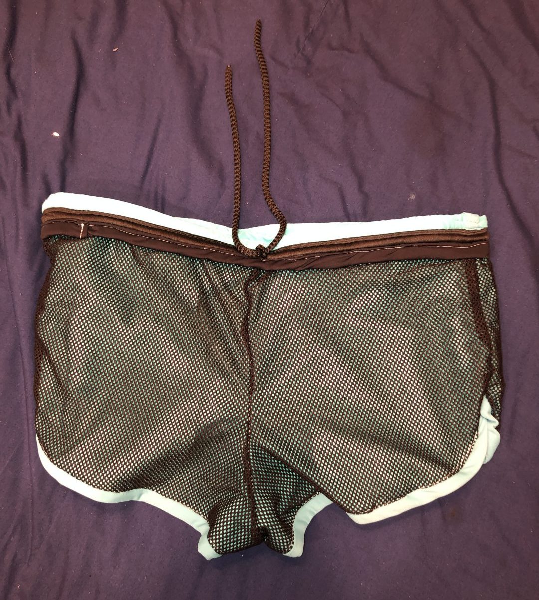
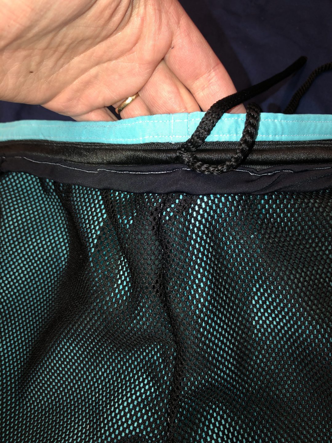
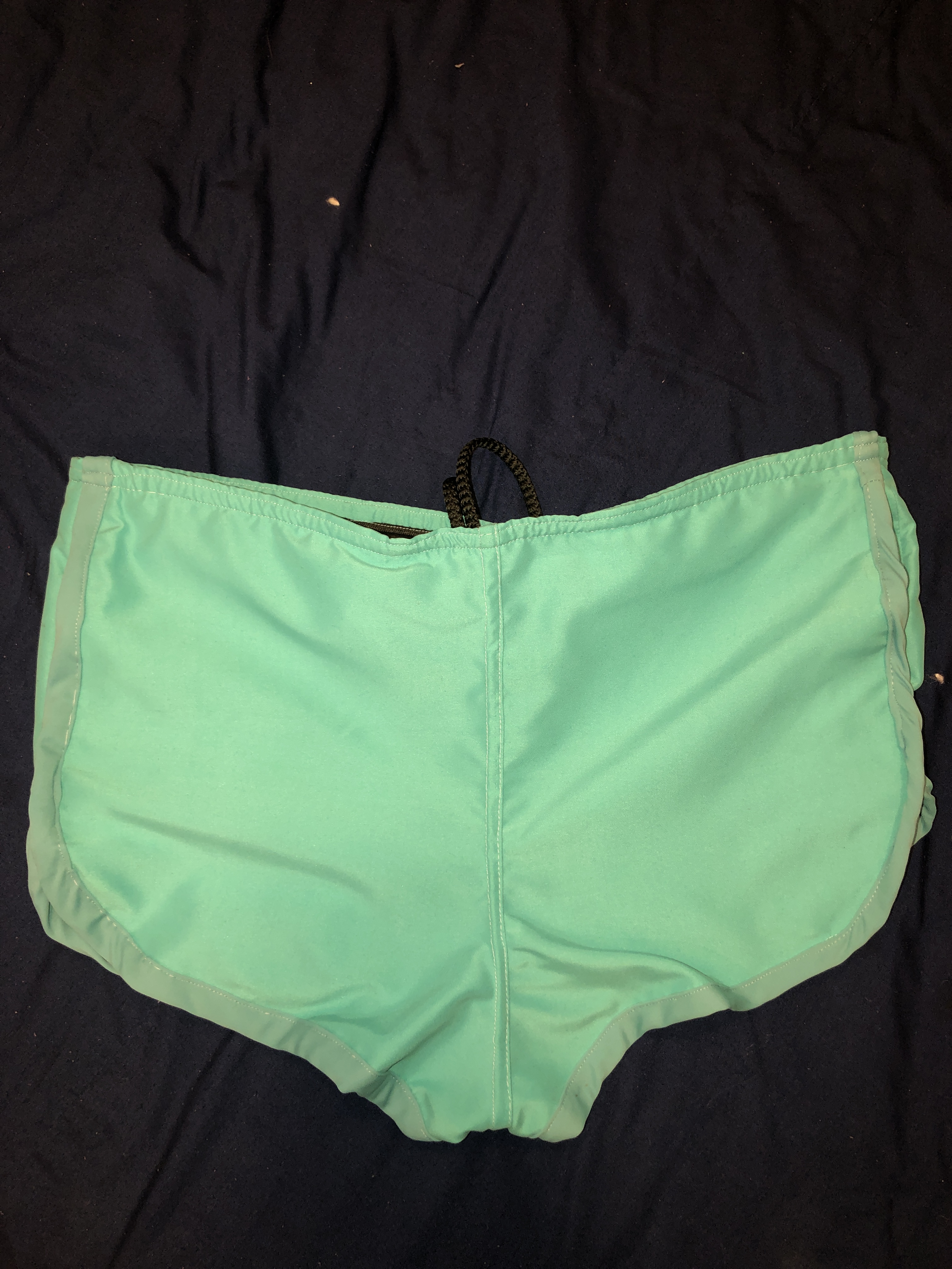
The Finished Product
This second shows the final product, my mens swim trunks.

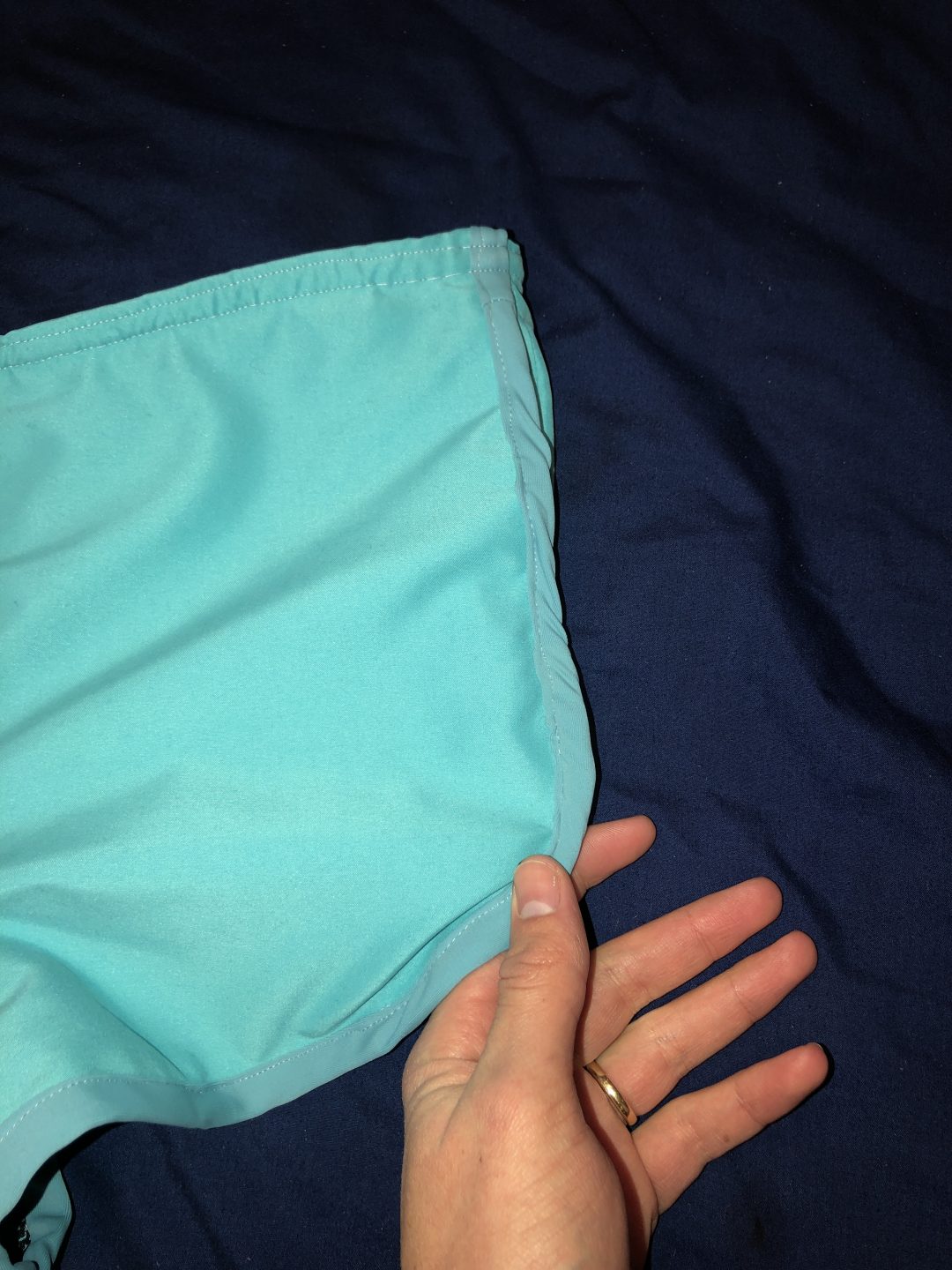

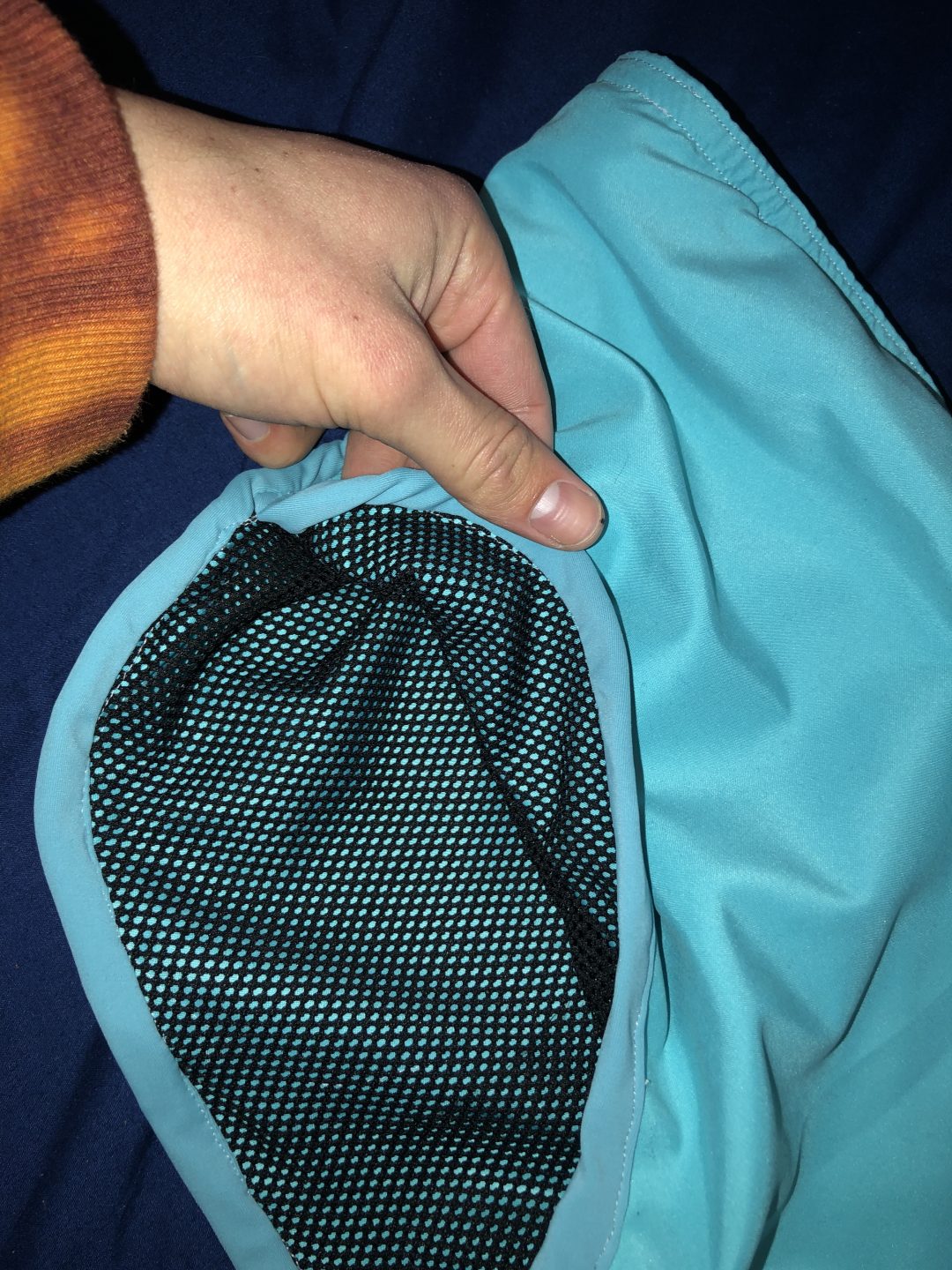
Pockets

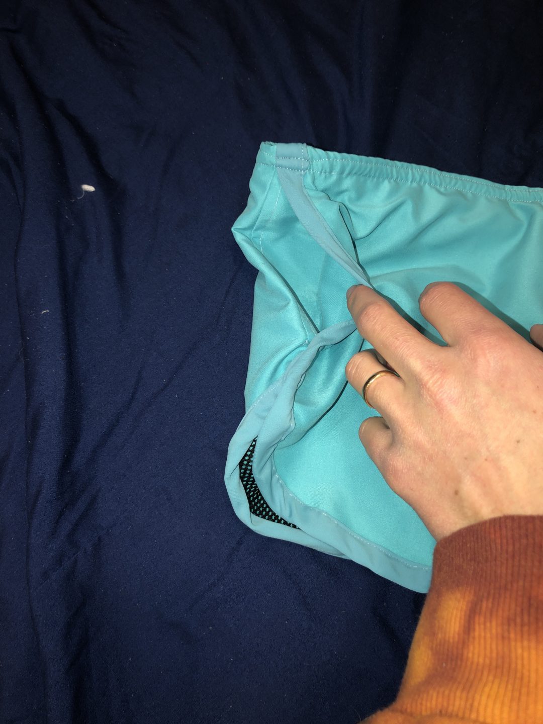
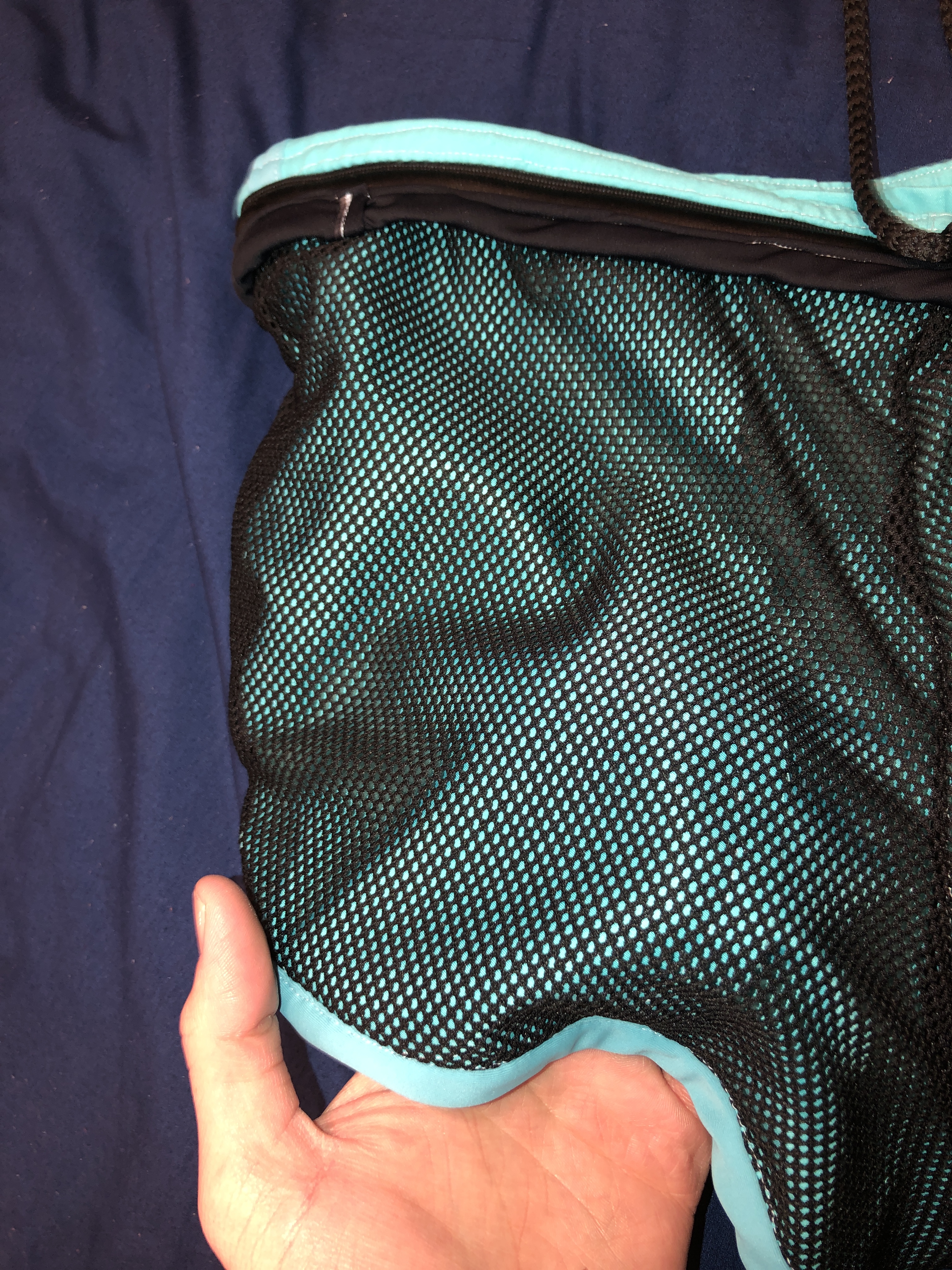
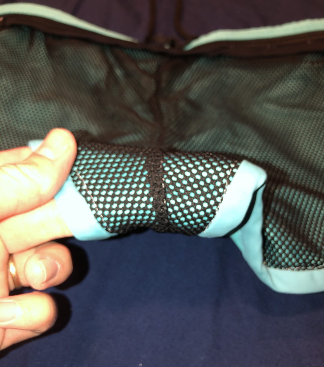
Linning
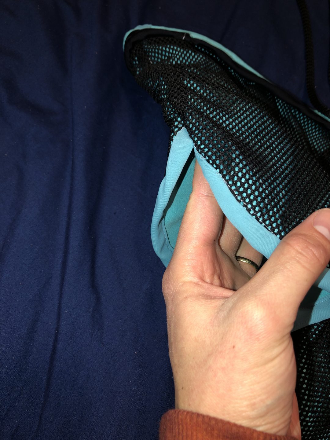
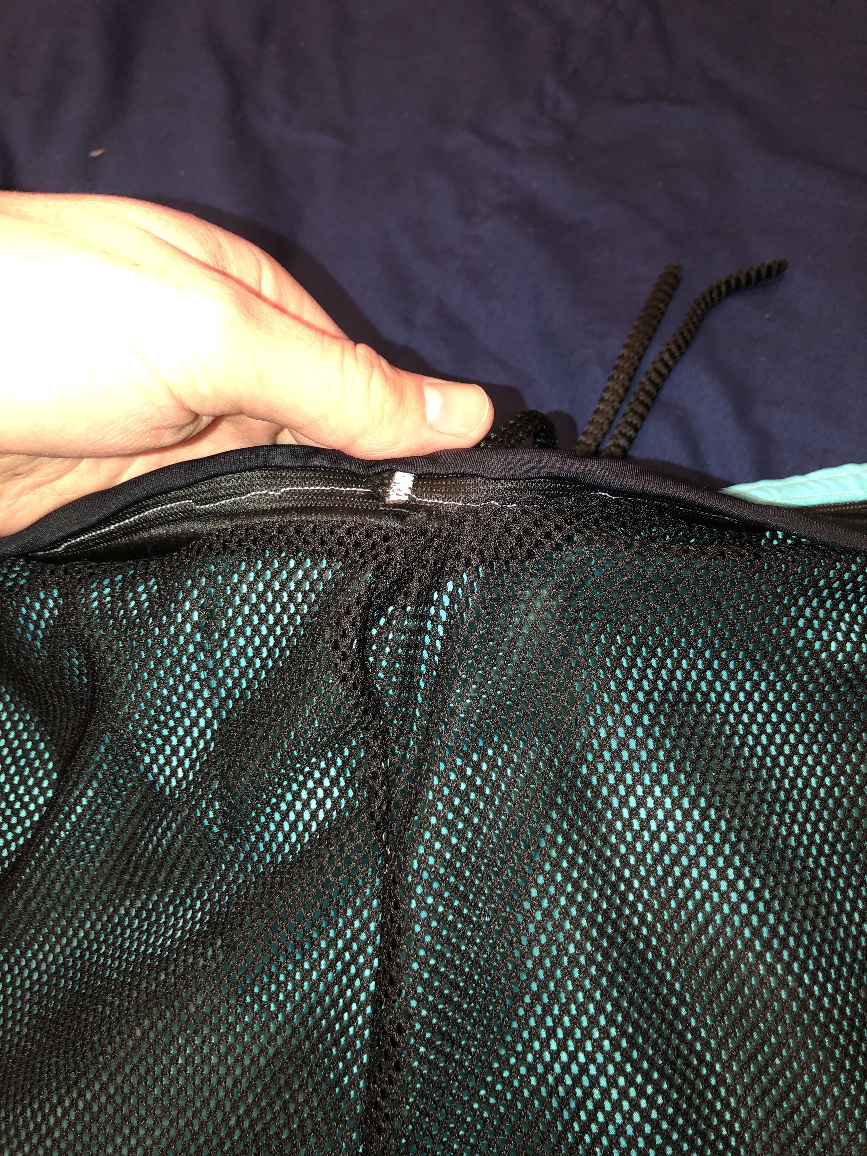
Waste band and Draw strings
UNFINISHED PART
This is the end, make sure that you have clicked on each photo you would like to take a closer look at. I have enabled that feature on this post. Let me know what you think in the comments below