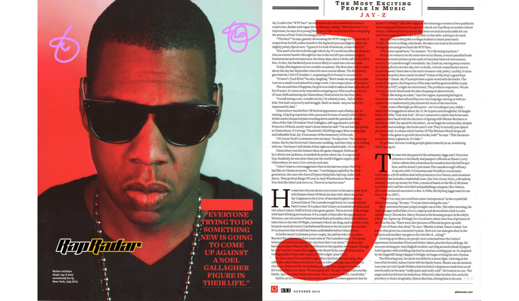
I love the Large J in the center of the page to the right, It’s a bold move. The way you are able to read through the J is amazing. The fade is great, and its not too distracting. I also like how they used the colour red in the J to match the red on the far right. It gives the black and white good contrast and complements the page.
Big J

The difference from the oldstyle font circled in green to the san serif font circled in yellow is a big one. Just like Jay-Z who is known to be a big man with a big personality. The large J in the middl of the right hand page seems to jump out at the reader. Typically oldstyle font and san serif aren’t grouped together, let alone on the same page.
Different types of type…

the 5 O
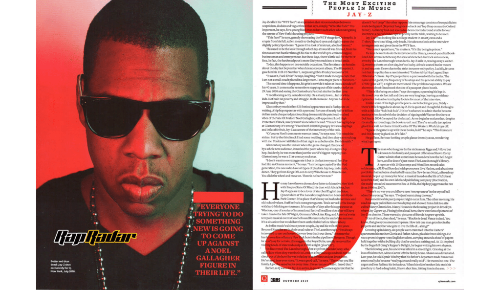
Depth of field is shown in this photo. The photo is almost like a mug shot with the red on one side of his face with the more blue lighting on the other side of his face. Telling us that he is on the wrong side of the law, like the lights on a police car. . But yet the back ground is still almost blank with the lighting just hinting at that. Jay-Z is front and center, he is of supreme importance in this article, he is somone not to be trifled with.


In the pictures that I showed above I tried to have the back ground blurred. It wasn’t easy honestly and I probably didn’t do a good job, I am no photographer. But I tried to blur the back ground, with the cool lighting effect like on the photo and then I tried to align myself to the same orientation as Jay-Z was. All in all I think they turned out good.
