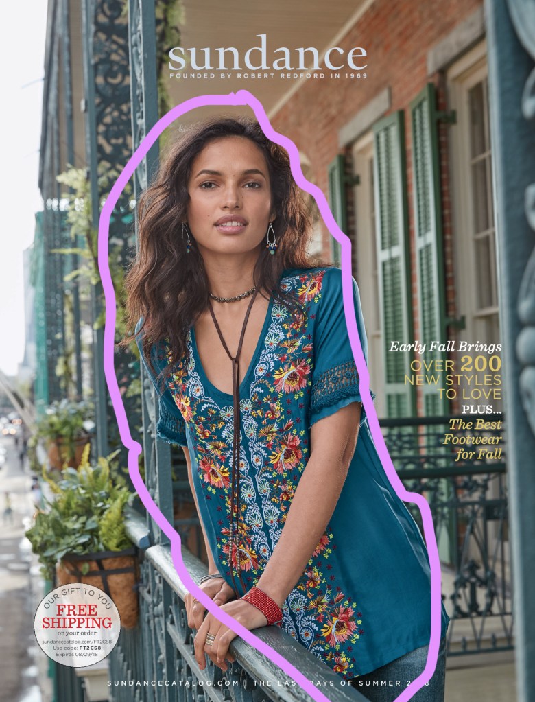
EXAMPLE AD

https://www.artisancolour.com/portfolio/portfolio-items/sundance/
This Magazine cover was created by Artisan Colour. They work with the sundance catalog to create their magazines. This one was made for the summer 2018 catalog that they sent to there subscribing customers.
Analysis

Notice how her head is aligned to be in the top third of the photo but it centered. while the rest of her body is going off to the right twisting slightly. The alignment in the photo works great with the decorative metal pole in the background. Even her eyes seem aligned.
Colour

The colour in the shirt of classic sundance catalog colours, they are oh a lighter hue. The colors around this lady complement the shirt, wrist jewelry and neck jewelry she is wearing. The colours of the stamp on the bottom left of the cover also go along with the colours of the photo.
Typography

The type in this magazine cover shows that the creator was aware of the colours in the photo. The lady’s shirt & jewelry, are all different colors but the colour of the type complements the cover. This cover I would say is pleasing to the eye.
MY AD
Design
The proximity on this ad is going from top to bottom, with the words squished at the bottom of the magazine cover. On the left, we have almost a list, giving the viewer important information about the catalog inside.
Colour

The colours found in this magazine cover are blue-tints. I think they may be analogous, but I am not quite sure. The man’s jean jacket has a white fur inside showing similar colours to his skin tone, I think they lightened his skin to be similar to the fur. His white shirt is of the same hue as the window behind him.
Typography
I tried to match the type in the original photo to the best of my abilities, but I may have not done the best. I do think the type that I circled compliments the colour of the jean jacket. I also think the placement of the type works better for this photo, it was hard to find one that matched the original photo. But the type I think looks great. I used both serif and san serif type.
Conclusion
In conclusion, I have found it hard to match not only a picture but the type someone else has used. It was a fun challenge, I do feel like I should have fixed the squish of the type at the bottom of my ad. I could see sundance using the ad I made for a winter catalog cover. I think it works just as well as the example.