Week 4
Colour

The colours that the designer used are very intentional. The red represents passion, angerer or hunger. Whereas the blue represents calmness, peace, and tranquillity. These two colours are at odds with each other, but they are blended together to give us a few emotions at the same time. The powder blue in the back ground calms the view even further.
Alignment
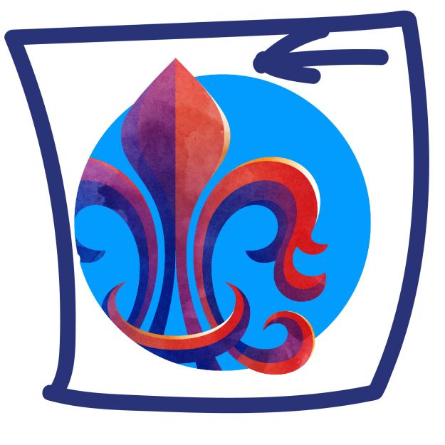
In the image above, we can see that the designer aligned to the left side. He put the icon on the left side of the image. The intentional misalignment tells me, that we the viewers are supposed to wonder what is behind the unseen parts. We supposed to be put off by the misalignment.
Proximity
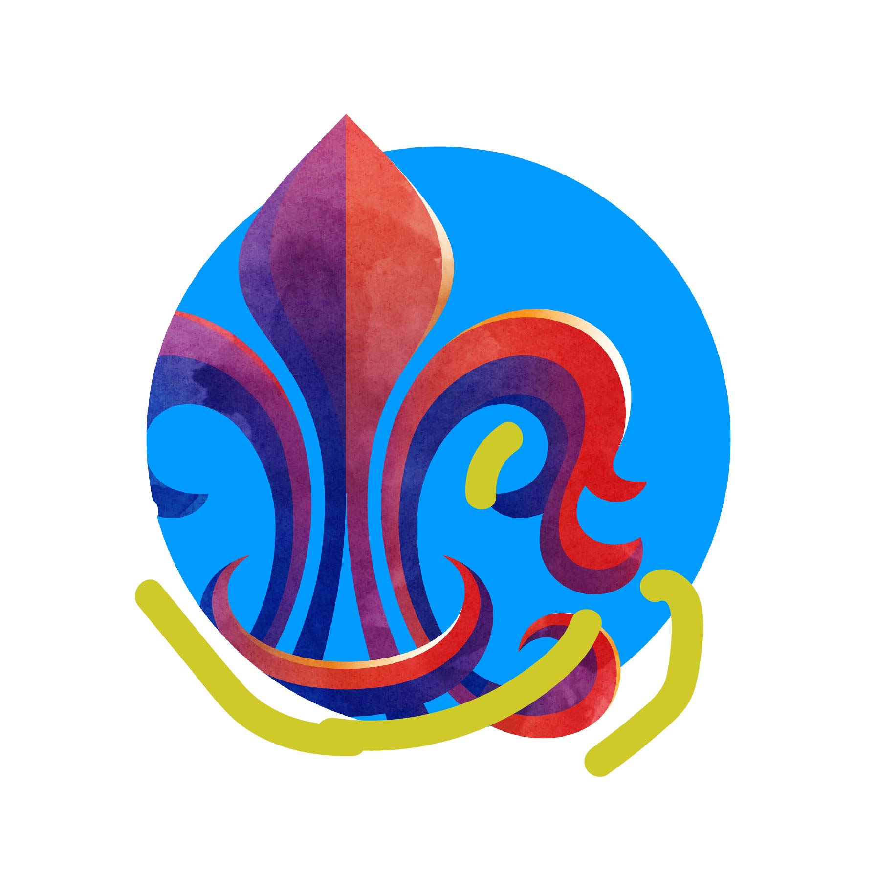
Notice how the designer used proximity to show depth. We know that part of the image is indirect light. The designer also made sure to put a crescent shape at the bottom of the image infant of everything and aligned it with the rest of the icon.
